So I've come to a decision on what to do for my final piece. The main theme will be destruction to construction. I decided on this idea because it surrounds us all in the urban environment that we live in. In addition, it is able to link to more than one of my inital ideas.
I wanted to construct my final piece on something other than an A3/2 sheet of cartridge paper. As a result, I am now working on a long sheet of lining paper.
The illustration will begin with buildings that are faded out from the bottom and given an unfinished look, to demonstrate destruction. On the opposite side, there will be bulidings being constucted, so images of scafolding and cranes will be visable.
Wednesday, 25 July 2012
Wednesday, 11 July 2012
Prep for Urbanscape Final Piece
After brainstorming ideas I have began to compose some inital ideas and I printed out more photos that associated with these outcomes.
 I dressed up as a thug in order to illustrate the harsh dangers faced by many roaming around streets. This enabled wearing stereotypical clothing; tracksuit bottoms, trainers, a hoodie, a cap and a scarf around the face. After uploading the images onto my laptop, I edited some of them to create a gritty texture.
I was able to take a photo of two of my classmates dressed in hoodies to demonstrate the hooded men that are on the streets.

This was a photo I captured on a trip to Wales. We were driving through the picturesque national park and stopped off at a spot to take photographs as memories of the mesmorising sites. To our amazement, there was a pile of rubbish dumped on the crisp green grass, ruining the scenery surrounding it. We were so outstounded by this purposeful visual pollution that we took a photo of the scene.
This provides evidence on the miss-use of land and highlights peoples' carelessness for the few natural elements that remain.

I was able to take this photo the day after it was burnt down. The previous night before the photo, opposite my house, the car was set alight. Flames roared out from within and the firebrigade had to be called to wash out the fire. The damage left behind displayed unusual textures, which I was able to capture.
The photos I captured will help demonstrate destruction and portrays examples of unique textures.

During one of the school holidays, my family and I decided to go for a walk in Valentines Park. Whilst we were there a lud explosion from nearby drew our attention. As we arrived closer, we discovered that a house close to the park was engulfed in flames. Smoke arrose from the house in mass amounts.
I would be able to use this photo when creating a composition were the buildings are set alight.

On evening we lit the firepit using the remaining coal from our barbeque and burnt paper (such as religious photos, which we are unable to bin). This created a warm flames which kept us warm, as we surrounded the firepit in our garden.
The image I was able to capture will help me to illustrate buildings on fire.
Saturday, 7 July 2012
Hmmmm.... What to do?? ...
So I've been set a breif for my final piece in my Urbanscape unit. I have to produce a final piece, of any shape or size, using my primary images and I must include at least one printing technique.
At the moment, I have no idea what to do. I have started to brainstrom ideas of areas I can look into to represent Urbanscape. Once I decide on the image I would like to produce I will then decide on a printing technique, the size and the material I will work on.
My ideas so far are based upon every day issues in our urban environment and instant visions people contemplate about when familarised with the word 'urban'.
Final Piece Ideas:
-Construction (new buildings - scafolding, cranes)
-Destruction (London riots, fire, police force, broken glass)
-Knife Crime (hooded men, alleyways, murders)
-Global Warming (weather disasters- flooding, heat wave, drought)
-Pollution (cars, factories)
-Bands (influences, extensive amount of different bands and lies)
Tuesday, 3 July 2012
Dexter Dalwood
An artist that I had to look at was Dexter Dalwood.

I chose two pieces of his work to analyse; The Calm and The Poll Tax Riots.

'The Poll Tax Riots' demonstrated a very urban, street art illustration; therefore I believed it related to the topic very well. The whole image seemed to be the after effect of a polling day.
I interpreted the blue wash in the foreground as a pool of water, which undercovered the fire that was engulfing the surrounding buildings.
 'The Calm' stood out to me because of the irony in the piece. Although, named calm the picture demonstates mass distruction. The tears of paper dividing the page into three vivid factions emphasises this. I believe the strip of green in the centre portrays the view before the devistation and the surrounding dull environment is what the landscape looks like now.
Thursday, 28 June 2012
Editing Photos

I edited the images by using an online site to add different effects and change elements of the photographs; including the contrast, temperature, highlights, shaddows, ect.


Laura Barnard
An artist that I looked at after drawing my idea for my polyboard, was Laura Barnard.
I was able to discover that there is an artist, whose work is similar to the style I used to create my composition for my print.
I was able to discover that there is an artist, whose work is similar to the style I used to create my composition for my print.

Jan Levy
The other artist I looked at is Jan Levy.
Jan Levy also uses very extravigant colours, however there is no simplicity in the work.
This is the website I used in order to gather information and secondary images.

Paul Catherall
Whilst my teacher was away on a trip I had to analyse two artists out of a list of four.
Paul Catherall is an artist whose work I annaylsed.

Paul Catherall is a printmaker and illustrator, who is based in London. He produces sharp, clean lino prints of landmarks within cities.
His artwork reminds me of the collages I have had to produce in class.

His artwork reminds me of the collages I have had to produce in class.

Monday, 25 June 2012
Blinging out my cover...
Over the weekend I took the scraps of my mum's fabric and began decorating the front cover of my sketch book.


I wanted my sketchbook to look appealing, unique and represent my personality/style from the second you set eyes on my book.
Monday, 18 June 2012
Collograph: the sketch

In order to create my collograph I needed to sketch a simple image from my primary images. This was my half term homework (4th June - 8th June). I decided to shade the drawing, as I believe my sketchbook is lacking in tonal drawings; therefore I wanted to demonstrate my ability in the skill. For my collograph I won't include the shading in order to allow it to be simplier and therefore I'll be able to produce a successful collograph.
Stephen Wiltshire
Stephen Wiltshire is an autistic artist who specialises in drawing skylines using thin, black pen.
He was the first artist that I researched for this unit.
He was the first artist that I researched for this unit.

The image above is one of the many panoramas Wiltshire has drawn purely from memory.
 In this piece of work Wiltshire used paint to heighten the attractive, auburn, autumn leaves. I'm particularly fond of this image because I myself enjoy painting trees with watercolour, as I admire the fresh and natural, yet mesmorising colours and textures it adds to the atmosphere. He rarely uses colour, therefore he has specifically decided that the colour in the trees are worth adding to his artwork. As a result, he too may have fondness of the organic beauty of trees.
The image is of Albert Bridge in London.^^
 <<This was my response to Stephen Wiltshire, after analysing his artwork.

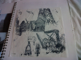
Printing with a Polyboard

In order to begin my print I had to draw my image in my book using my primary imagery. The sketch had to be no bigger than A4 and no smaller than A5.
I decided to merge elements of a few primary images into one piece. This allowed a variety of different shapes, sizes and textures.

After converting my sketch onto tracing paper I engraved the design into a polyboard. This was a very difficult process as it is hard to create straight lines in that specific material and I needed to ensure I did not engrave it too deeply so that it breaks, but deep enough so that the print will work. At first I used a sharp pencil to do this, however I discovered later that it was easier to use the point of a compass from a maths set.

Monoprints
Throughout this unit I have been assigned many printing tasks. One of these was to produce monoprints by rolling paint out onto the table, placing my sheet on top of the blanket of paint (without applying pressure to it) and then drawing on top of the paper. When the page is lifted on the opposite side you will find your monoprint.


This is my most successful monoprint as you are able to see the actual image that I drew.
Overall, I was not fond of this method of monoprinting, as I found that majority of the time my prints did not turn out successfully. In addition, it is quite uncomfortable to draw without touching the paper.

Another method was to roll out paint onto the surface of a table, then using a glue spread wipe off lines of paint and draw out the image you wish to print. Afterwards, place your sheet of paper on top of this and apply pressure onto it (either simply with your hands or with a clean roller). Remove the sheet and you will find your print has transferred onto the paper.
I am quite pleased with my attempt (above). However, I have been told by my teacher to work back into the print; to highlight the outlines. I found this print was much easier to do rather than the first method, as you are aware of what the print will actually look like and it is harder for it to turn out unsuccessfully (by your print not being able to recognise).
Urbanscape
Urbanscape was the title of my second unit in my first year of art GCSE, which I am still in the middle of completing.
The unit allowed a range of man-made imagery, including buildings (skyscrapers and flats), construction (scafolding and cranes), graffiti, roads (signs, cones and road works) and textures.
 After brainstorming ideas I began to experiment drawing buildings with different medias. This enabled me to draw using pen and coloured pencil; which I haven't done before.
As I was assigned this task I was daunted by what lay ahead, becuase by using pen I did not have the comfort of being able to rub something out.
 -Although I usually enjoy and prefer to use watercolour to produce a piece of artwork, I discovered after painting Jumeria Beach Hotel that I was unable to add detail to the building.
This may have been because of my inability to keep a steady hand, however I believe the size of the painting also contributed towards this.
 Due to my inefficient time management skills I was set the task of producing a drawing, using a media that I was not used to, within 20 minutes.
I set a timer on my phone and set off to create a drawing in purple pen using one of my secondary photos.
I was quite pleased with the result as I came under the realisation that I could generate a detailed, proportionate image in a short space of time.
The unit allowed a range of man-made imagery, including buildings (skyscrapers and flats), construction (scafolding and cranes), graffiti, roads (signs, cones and road works) and textures.

As I was assigned this task I was daunted by what lay ahead, becuase by using pen I did not have the comfort of being able to rub something out.

This may have been because of my inability to keep a steady hand, however I believe the size of the painting also contributed towards this.
 Due to my inefficient time management skills I was set the task of producing a drawing, using a media that I was not used to, within 20 minutes.
 I set a timer on my phone and set off to create a drawing in purple pen using one of my secondary photos.
I was quite pleased with the result as I came under the realisation that I could generate a detailed, proportionate image in a short space of time.
Sunday, 17 June 2012
My First Post...

So I've just created my blog after receiving inspiration from my sister; who has already created her own blog, to begin writing in my own blog. It's a great way to keep a track of my progress during my art coursework and to express my views on my work.
I'm just getting used to the whole process and all of the functions, but pretty soon I will be able to display my progress on my art GCSE coursework so far.
x.
Subscribe to:
Comments (Atom)